"I want to make the green a hero"
By Dr. Ingrid Gardill, art historian, December 2023
Prehistory
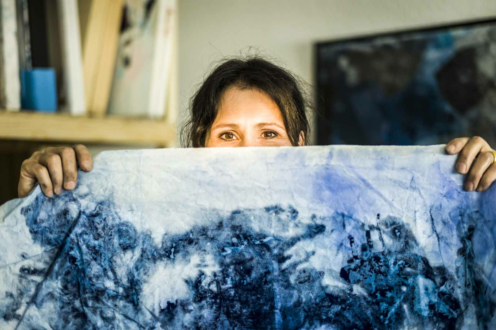
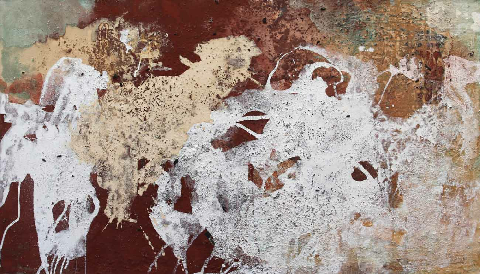
Katja Gramann calls her current series of large-format paintings, "Hoffnungsträger" (Bearer of hope). The starting point was an intensive exploration of the color green. The initial impetus came from a photo of a weathered and mossed-over quay wall painted by nature. She received the photo from her gallerist, which reminded him of works by the artist. For Katja Gramann, the visual reference set in motion a thorough artistic and theoretical research project.
She asked herself why there are so few examples of the color green in art history. She found what she was looking for in Cy Twombly and Emil Schumacher, but did not use the color frequently. Neither did Claude Monet, whose water lily paintings contain a lot of green. Katja Gramann recognized that we do not really focus on the color there, but mainly see the blue surrounding the water lillies. - Why is that?
"Outcast" color
If we look at the historical context, we soon realize that the evaluation of color has obviously shaped our viewing habits over several centuries. In Leon Battista Alberti's treatise "Della pittura" from 1435, green was still one of the four "true colors", while in the writings of the 17th century, the triad of green, blue and greenish was still used. The fourth main color, green, was gradually degraded to a secondary color. The Swiss art historian Felix Thürlemann investigated this phenomenon of increasing ostracism, which ultimately culminated in the "color purism" of modernism. The author sees the cause of this evaluation as early as the painting of the European Middle Ages. In somewhat simplistic terms, green was symbolically assigned to the earthly realm, while the primary colors were primarily reserved for the heavenly spheres. Incidentally, this is still reflected today in the use of liturgical colors for church services: green denotes all the days of the church year without a feast.
The three-color theory was not questioned later and had developed into a dogma in classical modernism, particularly in the teachings of the Bauhaus and the theory of abstraction. Thürlemann aptly summed up this tendency from around 1910 onwards in his essay: "Green is the color of the lower, naturally real realm; it stands in contradiction to the sublime world of the 'pure abstract'" (p. 23)! In 1912, Wassily Kandinsky made the corresponding derogatory comment that green had a passive, motionless, indifferent and boring effect (p. 94 f.).
Experiment
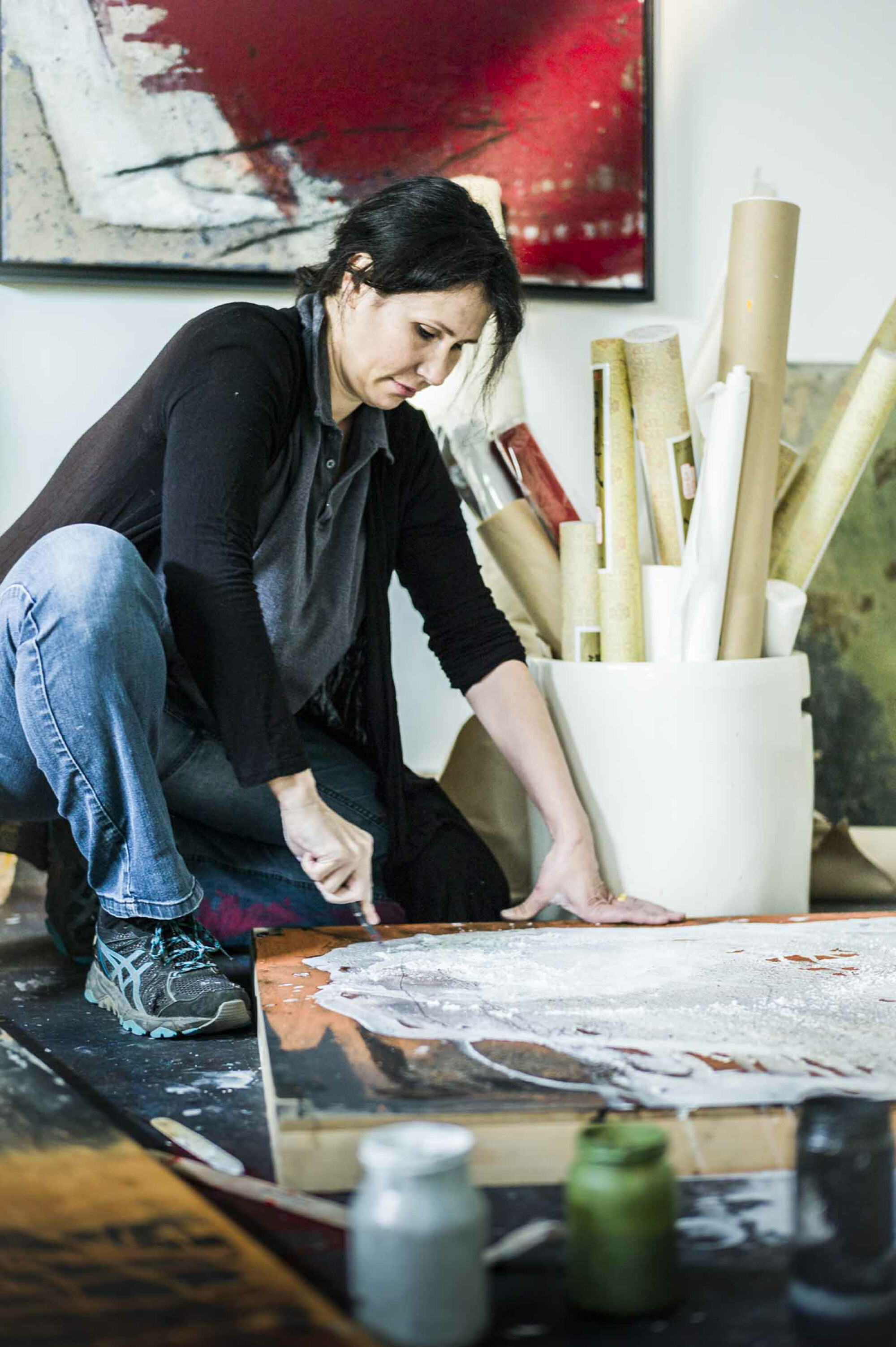
With her abstract art, Katja Gramann consciously broke away from this traditional and highly judgmental genesis of color. She began to experiment herself and bought an extensive palette of green pigment tones to create her own colors. The dealer warned her that green paintings would not sell, but this did not prove to be the case. His remark encouraged Katja Gramann even more to devote herself entirely to this color and to immerse herself in it for a while in order to explore it artistically.
A challenging, exciting journey of discovery began, which kept the painter in suspense for several months. The first attempts were less than satisfactory, as the color seemed dull and bold. She soon discovered that the green required a second color to achieve its effect. But interestingly, it then immediately faded into the background, similar to Monet's water lily paintings. The artist could not accept this, as green was to remain the main color. She was determined to "make it the hero".
Main color
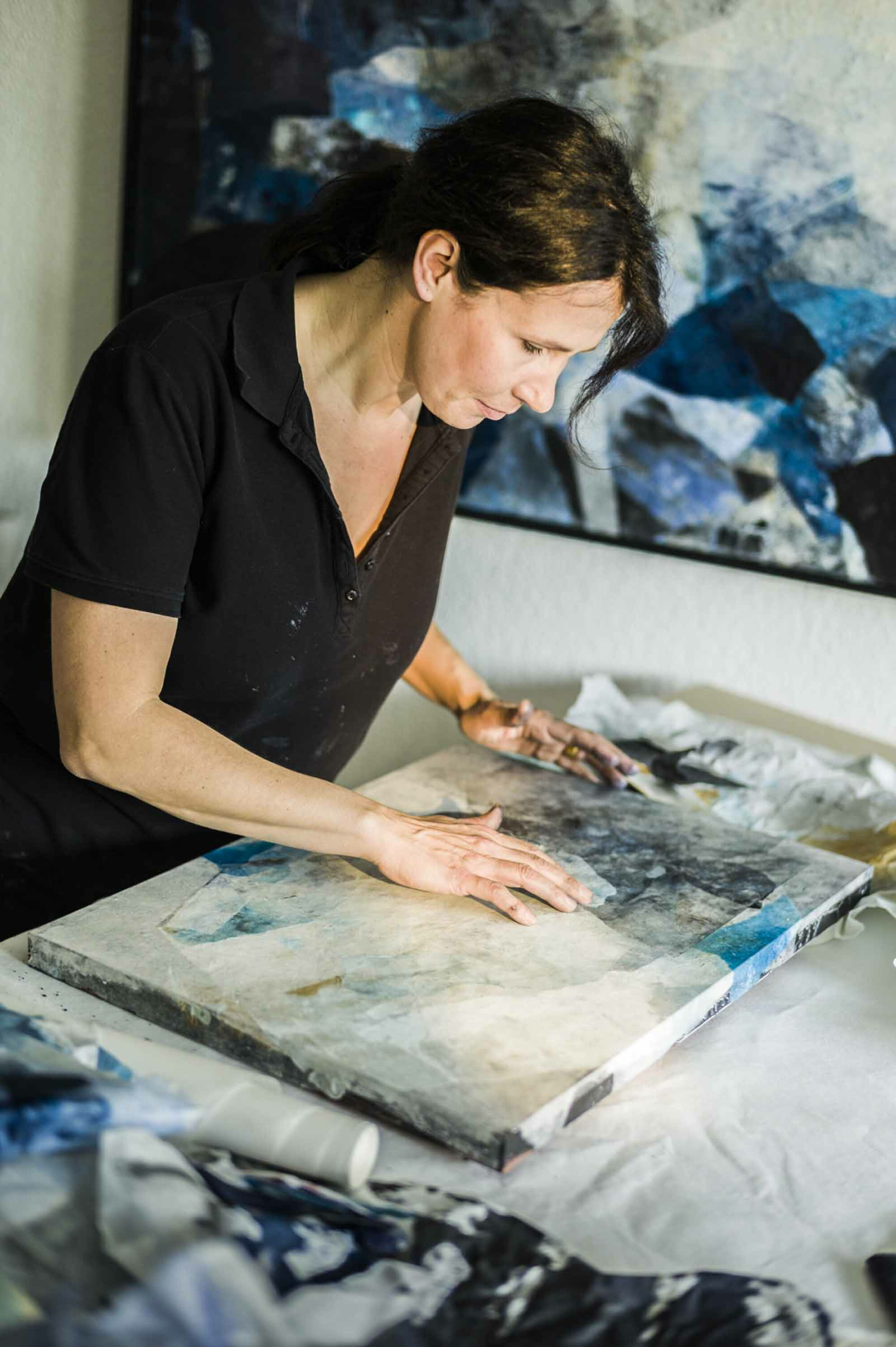
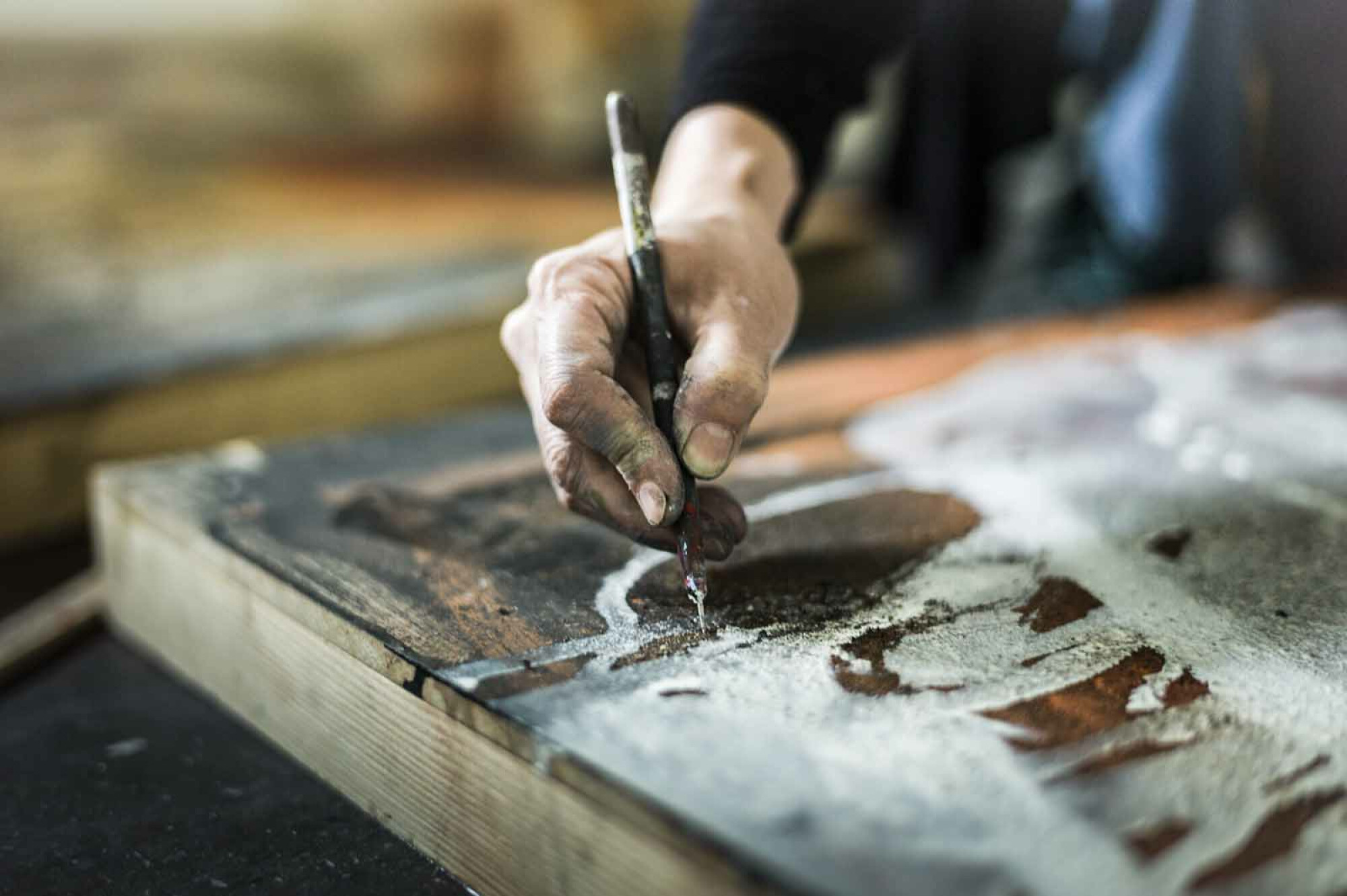
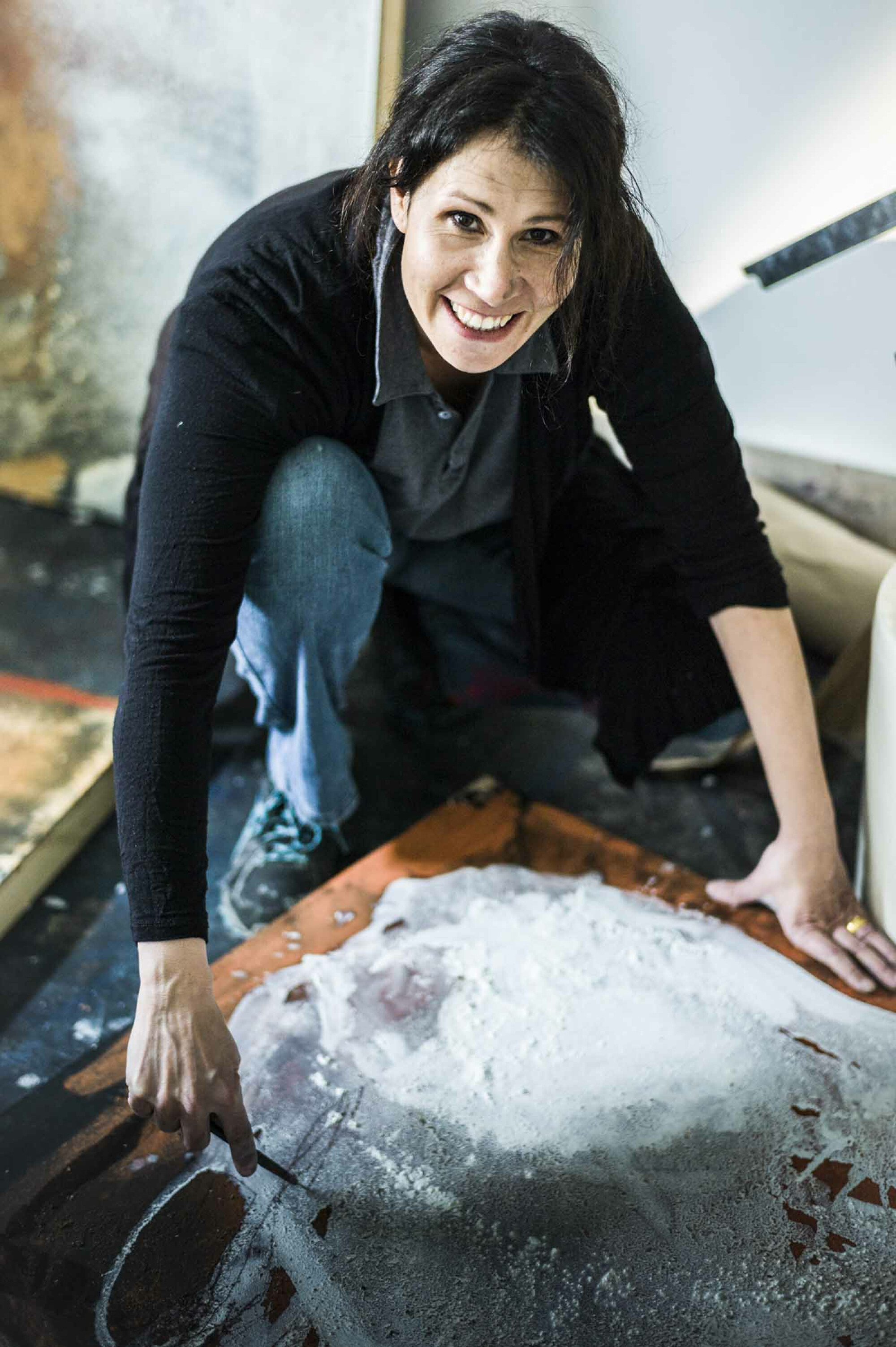
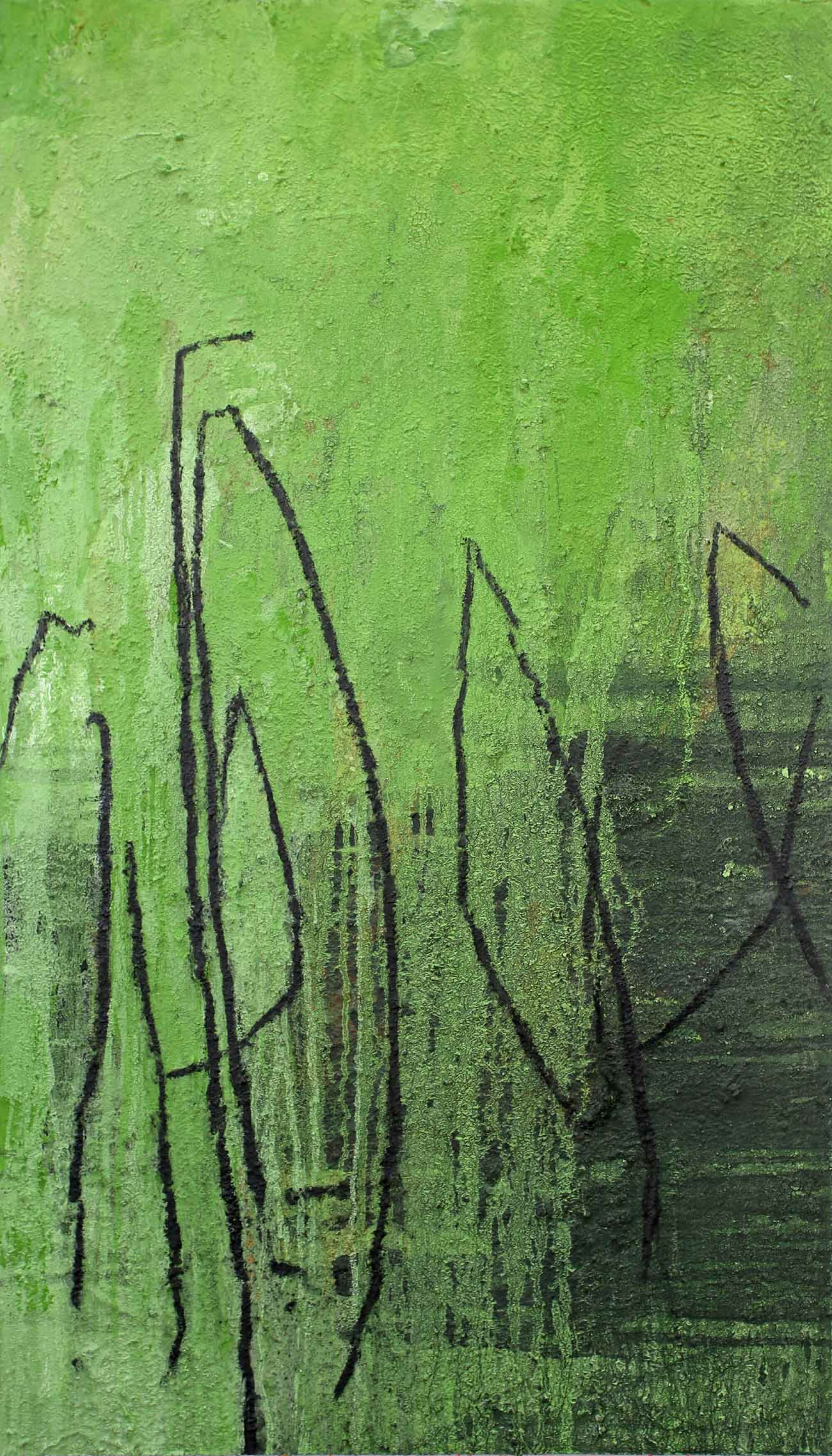
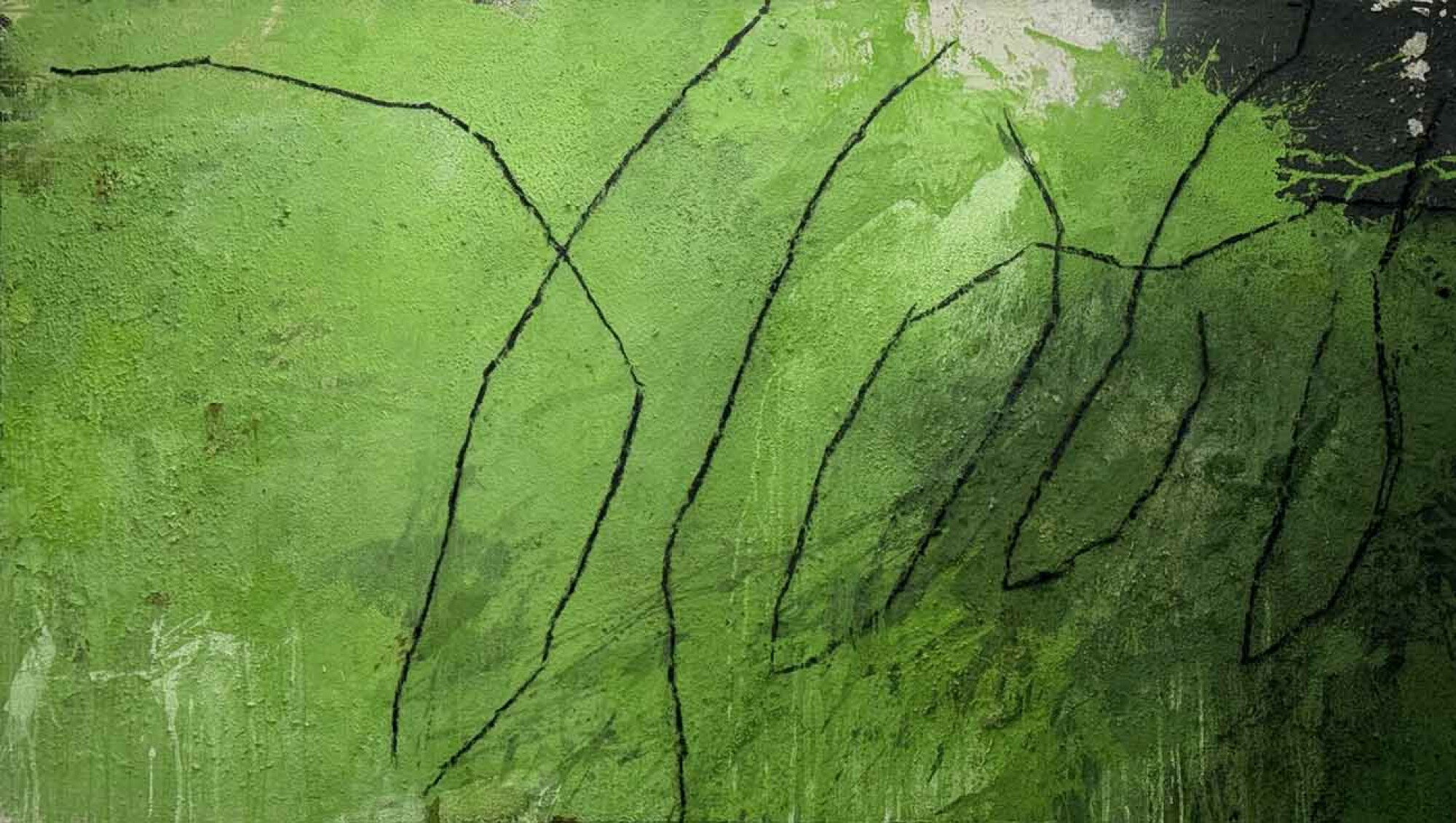
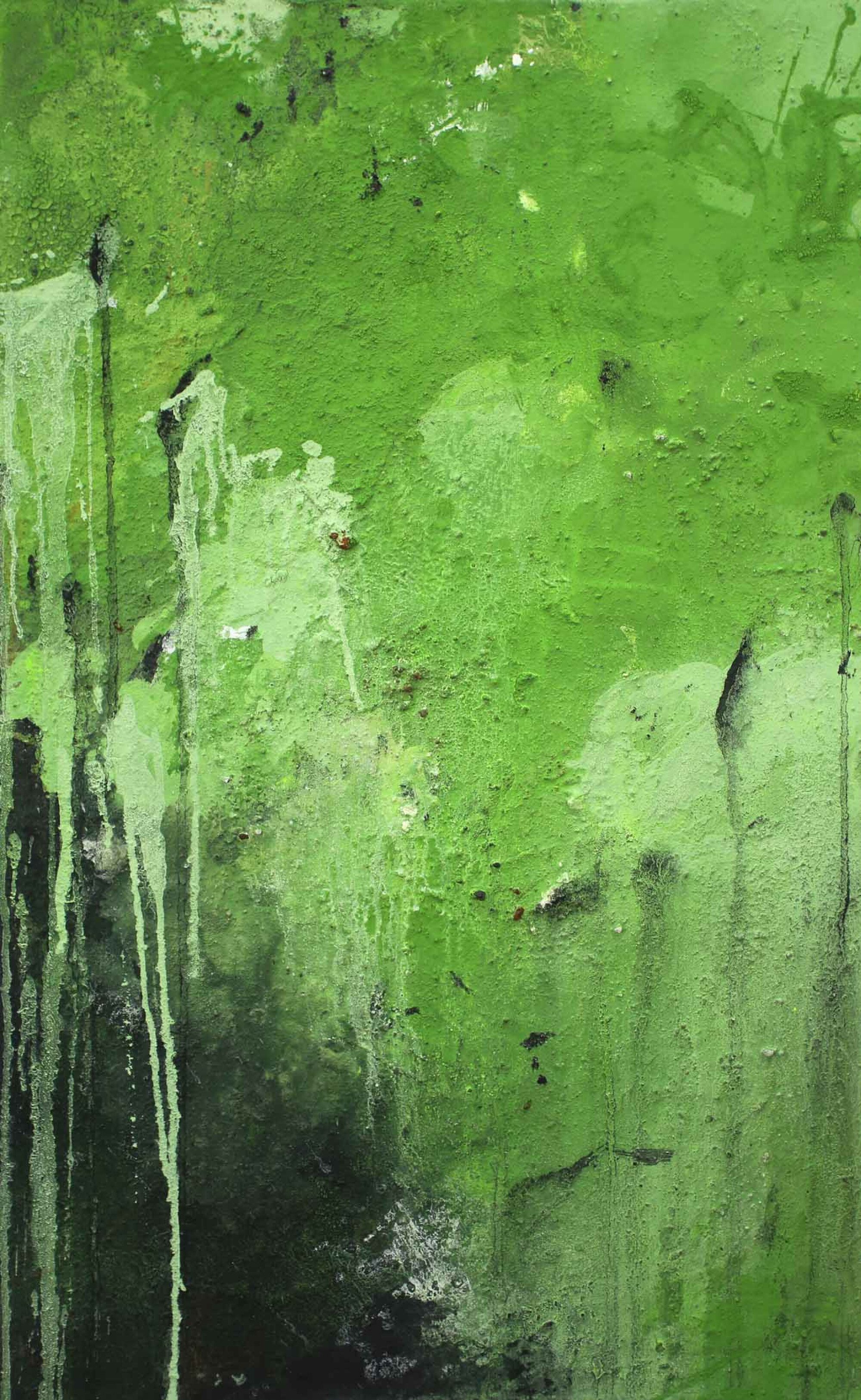
The observation that green in nature is extremely diverse and constantly changes depending on the incidence of light ultimately led Katja Gramann to the solution to the problem. She was able to use her rich experience with material paintings to create a certain structure with rock flour, ash, rust and other substances, on which she applied the green pigments in several work processes and layers. The shining through of underlying color layers, together with the diverse structures, created the change and animation she wanted to achieve. She found that the warm orange tone of the rust in tiny dots and flecks shimmering through was just the right amount to bring the sensitive green color to life.
Accentuation
In addition, she emphasized bright areas by using a subdued ash tone instead of the hard white, or she made the background appear darker in places, depending on the requirements. Finally, the artist enlivened the foreground of the pictures with runs of wet-applied, light or dark green pigment mixtures. In some compositions, she spontaneously applied the charcoal pencil to draw airy forms with loose, gestural lines that form another layer rich in contrast. Some of them are reminiscent of the outline of lancet-shaped leaves and thus incorporate the aspect of nature.
Message
Katja Gramann's long and persistent struggle to artistically capture and adequately implement the "rejected" color green, as well as the urgent desire to give it a place in art again, led her to virtually ally herself with the color and learn to appreciate it. She also feels that green is necessary for today's restless, unhinged times, as the color has a demonstrably calming effect on the eyes, the mind and the soul. The painter has temporarily chosen green as the color of hope and renewing life as an artistic response to the various ecological and social crises and has therefore called her new series of works "Bearer of hope."
Bibliography
Felix Thürlemann, Grün – die verstoßene Farbe. Zur Genealogie des modernen Farbpurismus. In: Rot, Gelb, Blau. Die Primärfarben in der Kunst des 20. Jahrhunderts, Hrsg. von Bernhard Bürgi, Stuttgart 1988, S. 11-27.
Eva Frodl-Kraft, Die Farbsprache der gotischen Malerei. In: Wiener Jahrbuch für Kunstgeschichte 30/31 (1977-1978) S. 89-178.
Renate Kroos, Farbe liturgisch in: Reallexikon zur Deutschen Kunstgeschichte Bd. VII (1974) S. 54-121.
Leon Battista Alberti, Della Pittura – Über die Malkunst, Hrsg. von Sandra Gianfreda und Oskar Bätschmann, Darmstadt 2002.
Wassily Kandinsky, Über das Geistige in der Kunst, Erstausgabe München 1912, Verweis aus: Bern 1973 (10. Aufl.)

